Interior Design Top Tips – Colour
- Decoration
- Interiors
- Lighting
- Styling
- Textiles
One thing you should never be afraid of is colour – from using different whites on white , to great dollops of primary colours, and using the merest hints – colour adds serious vibe and feeling to every space. While your don’t need to go full on Victorian (although if that’s your thing be my guest…) adding pops of colour to an interior really can bring a space together. So heres how to do it on a scale from 1-10 dependant on your appetite!
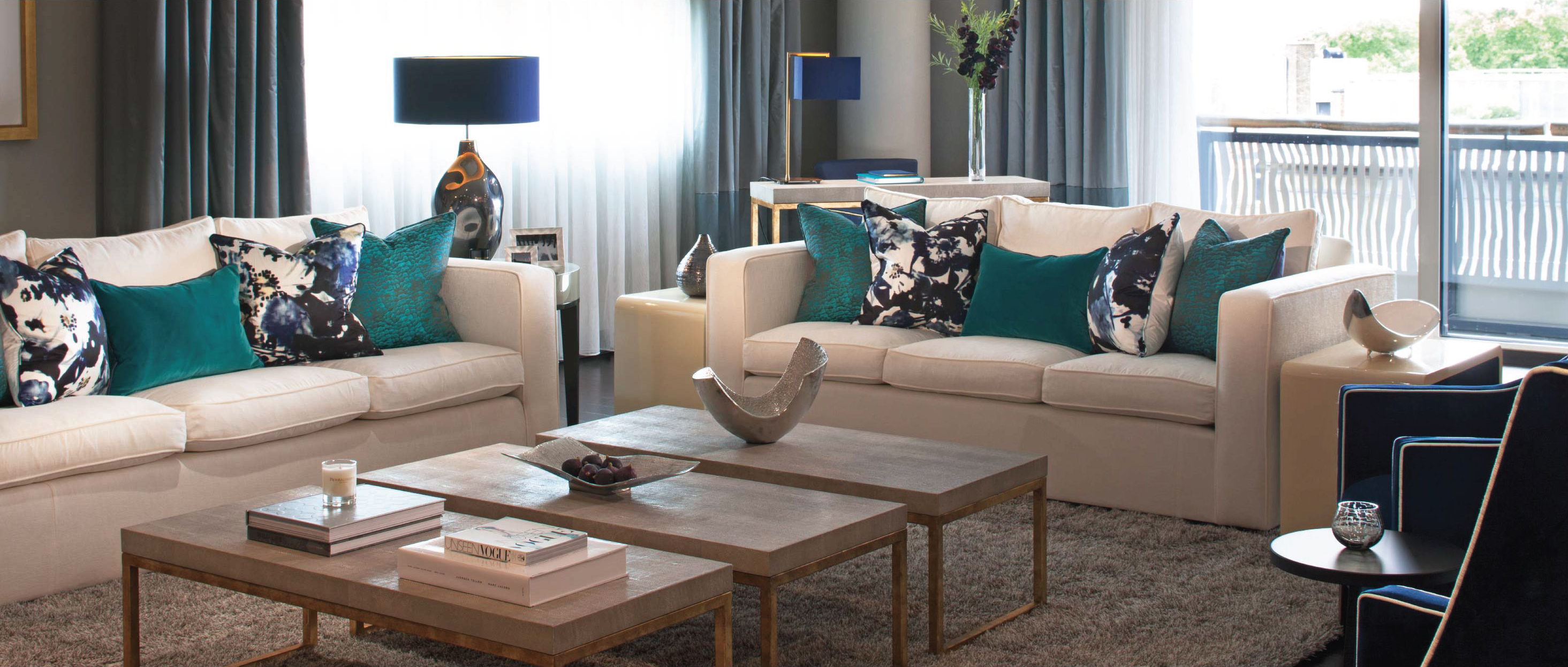
A great place to start with bright colour in an interior is through introducing accents. (accent colours are what bring emphasis to an interior scheme.) Below we introduced colour through a single lampshade and brass details whilst keeping the surrounding scheme neutral. Small items often make a difference, even the choice of floral arrangement can bring a new colour dimension to your space.
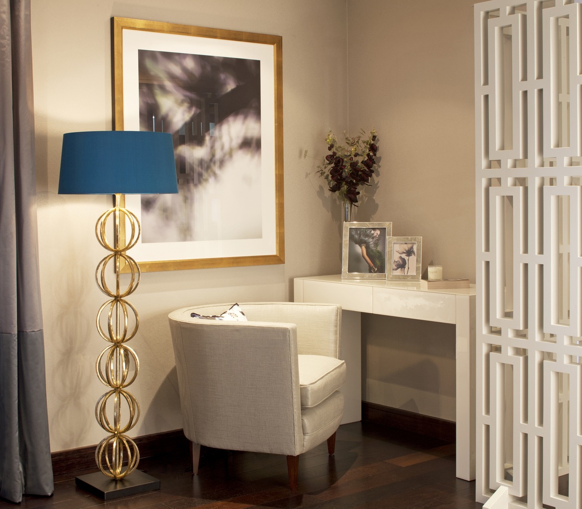
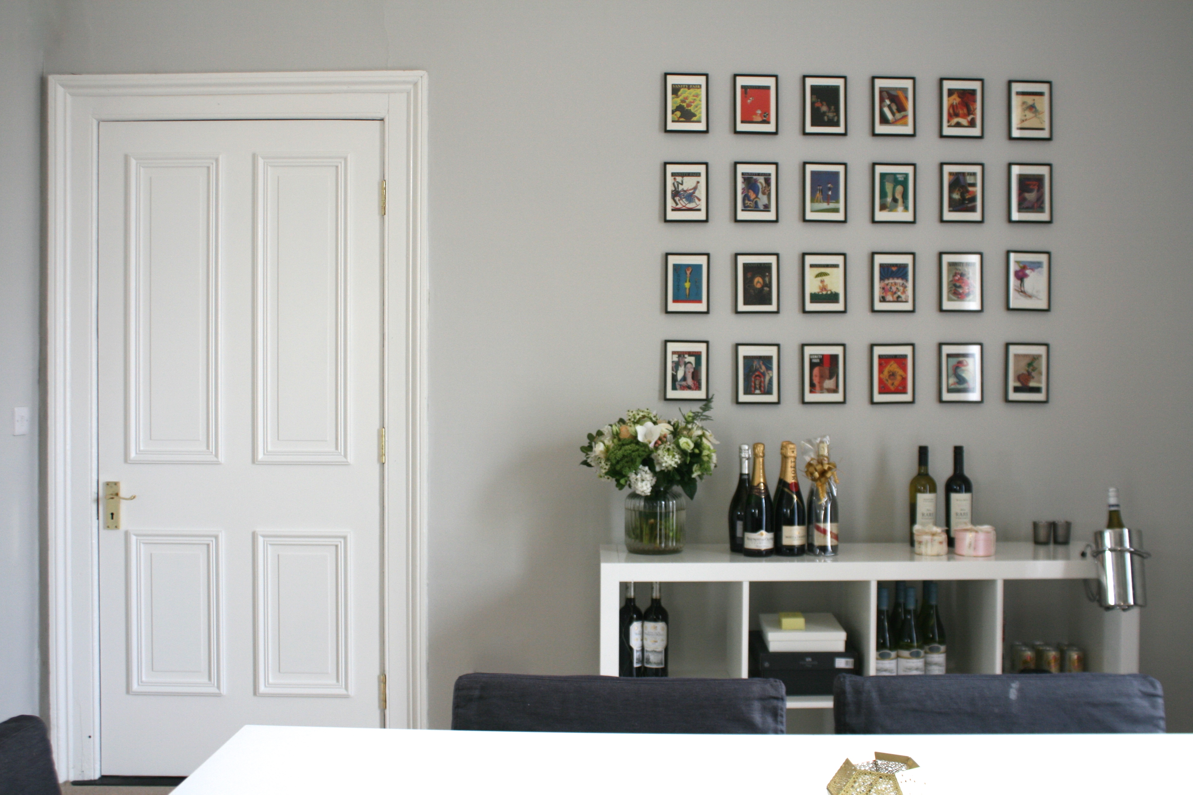
So whilst you might have taupe walls and cream carpets, or cool grey walls and limed oak floors- to bring interest and a twist add colour to your rug, cushions, art or accessories. Choose 1 colour to start off with and build from there with complimentary colours.
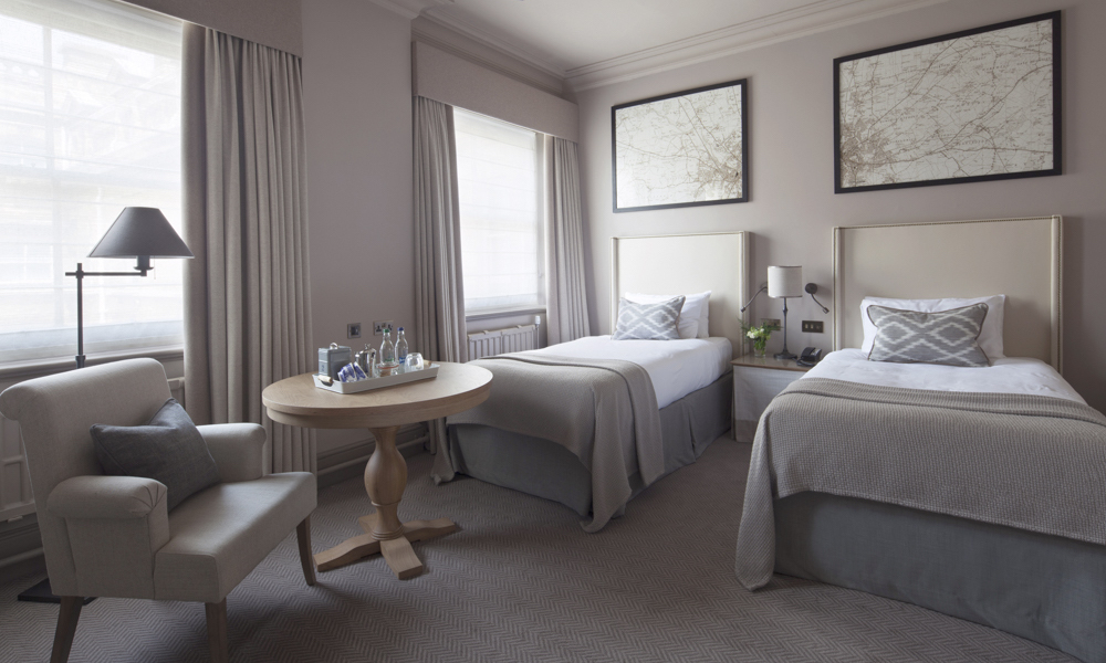
A subtle and sophisticated way to bring colour to a room is by choosing one colour and work with it through its shades and tones, this colour could be yellow or it could also be taupe or grey the same rule applies.
TOP TIPS: HOW TO DO IT
Keep it light on the walls, darker on the woodwork and lightest on the coving and ceiling.
This is a tried and true way to create colour balance in a room. You can then layer in accent colours to bring emphasis.
Paint and Paper Library handily number their some of their paint colours 1(lightest)-5(darkest) to help you on the way and they have a fabulous colour range.
Colour can also be used to manipulate space and alter the feel of a room, strong bold colours can make a space smaller and more intimate, whilst keeping a room light will greatly enhance a smaller room you want to feel bigger. Similarly high ceilings finished in a dark colour will seem lower or lower ceilings painted in light fresh colours will appear higher. The same room will feel completely different depending on the direction you choose.
As I mentioned in my previous post on light – the light levels in a room will also affect the atmosphere created by your chosen colour. If you are new to colour and are just testing out how far you want to go I recommend you starting a Pinterest board and collecting reference images. Print a few out of rooms using a colour you like and stick them on your pin board, after a few days see how you feel about them! Also most paint and wallpaper suppliers have sample sizes – paint up a section of wall or pin up a large wallpaper section. This can help you choose the exact colour for you.
For those of you who want to go full on with colour (and pattern) here are a few of my favorite suppliers for vibrant and darker colours:
Wallpaper, Fabrics & Accessories: http://www.houseofhackney.com
Lime wash paint: https://www.bauwerk.com.au
Styling & Accessories: http://www.dust.ie
Cushions & Throws: http://www.bonnieandneil.com.au