Reveal your home in its true colours
- Inspiration
- Interiors
- Styling
Sara featured in The Sunday Business Post last weekend to cover all things colour and the importance of incorporating it into your home, while sharing some insightful tips on how to do it!
When you are creating an interior design scheme you want to create something that has heart and soul. Colour can take your space to the next level; it is all about how you apply it. You can either drench the walls and ceilings, or you can just add pops of vibrant colour to bring a space to life.
So why use colour?
By adding colour, you create atmosphere and personality. A balanced use of colour creates harmony in a space while introducing accents can create focal points to delight the eye. Colour is a key tool in the designer’s bag as it can either accentuate or disguise a feature within a space.
Understanding Colour
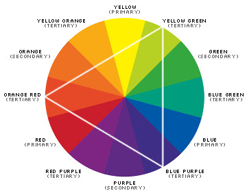
Colour is created by the way our eyes and brains receive different wavelengths of light when it reflects off objects. When you train as a designer, understanding colour is key and using the colour wheel is a core part of your studies. It helps you to understand what colours work together and why. To get started, the primary colours are red, yellow and blue and by combining these colours you can get every other colour. Secondary colours are green orange and violet and the tertiary colours are blue/green, red/orange and yellow/green. The complimentary colours are the colours that are directly opposite each other like yellow and violet and are often used in small quantities as accent colours. Triads form a triangle on the colour wheel like yellow/blue, red /orange, or green/violet. Analogous colours are the groups of colours that are right beside each other such as red, orange etc. Non-colours are the greys, beiges, greiges and of course white and black.
Colour in Action
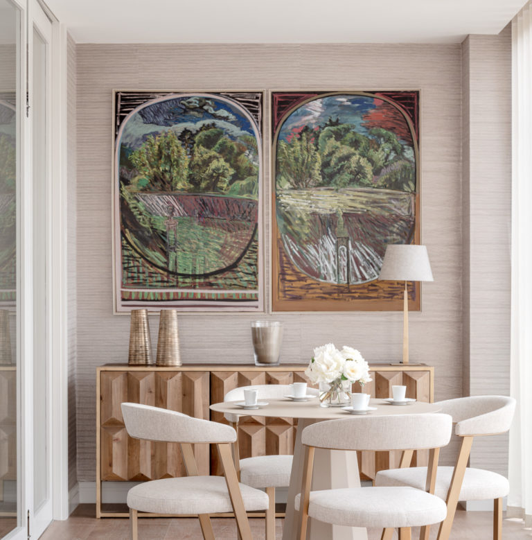
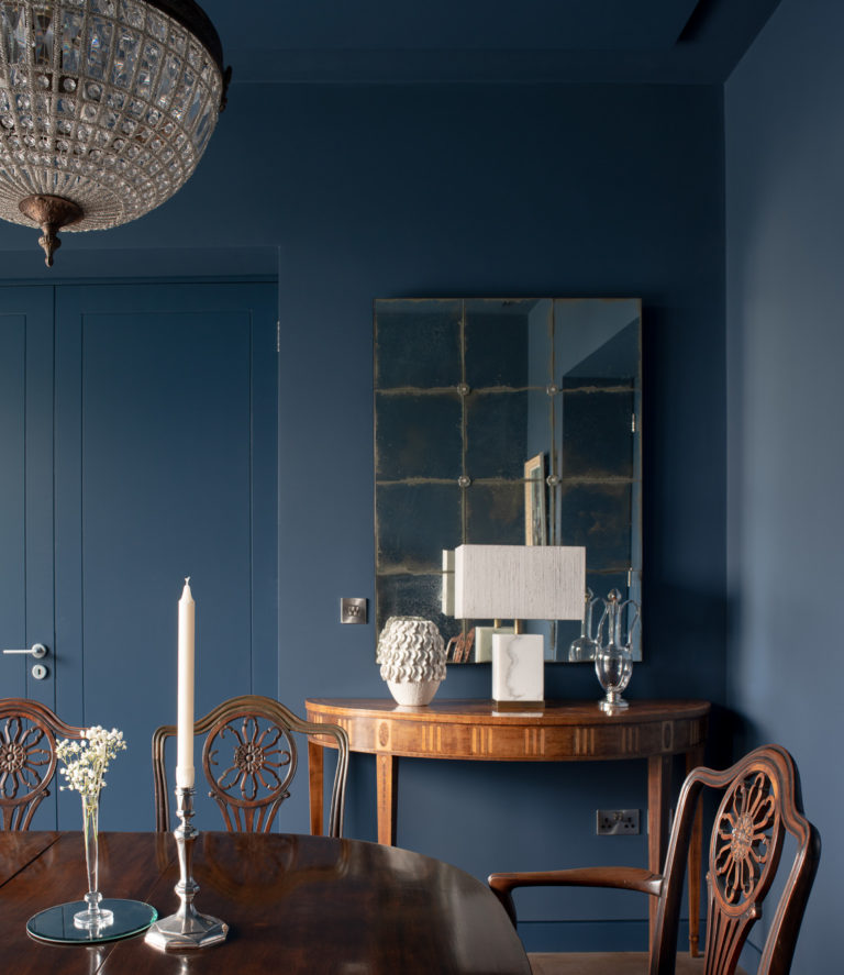
When we put a scheme together, we use every colour in the book. In fact, we use colour to curate and create the type of atmosphere we want to achieve in a space. For example, to create a room that is serene and relaxed we tend to go for more neutral colours – taupe’s, beiges and greiges. If you’re looking to create a bit more drama or a bit more WOW factor, we tend to go darker and saturated by incorporating deep reds and burgundies, navy blues or deep forest greens.
Some designers follow the 60 30 10 rule. This allows you to approach the design of a room by breaking the colours down into areas. You start with the 60% which is a single predominant colour for the room, this would normally be your walls or large areas such as carpets. Then the 30% is the secondary colour such as ceiling, curtains or rug/carpet and you will be using this in accent elements such as armchairs or artwork. Then there is the final 10% of colour. This will be small elements that just bring in more colour to the space and could be anything from throws and cushions to pieces of art or decorative items. Accent colours can be lighter colours in a dark room or darker colours in a lighter room.
Alternatively, you can go very neutral by taking creams, beiges, greiges and layering them up. When we design a room, we often have the accent colours in mind which allows us to help the client to see them as interchangeable. Then in coming years if you want to refresh your interior all you need to do is swap out your accent colour and it can completely transform your space.
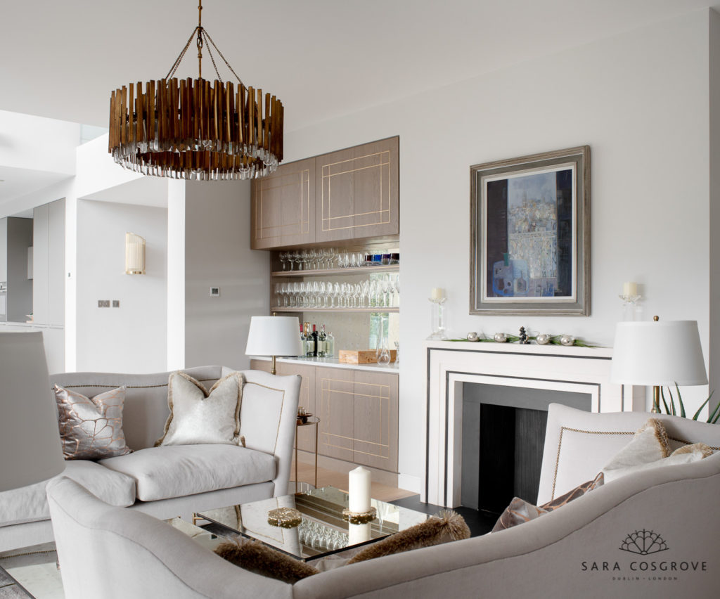
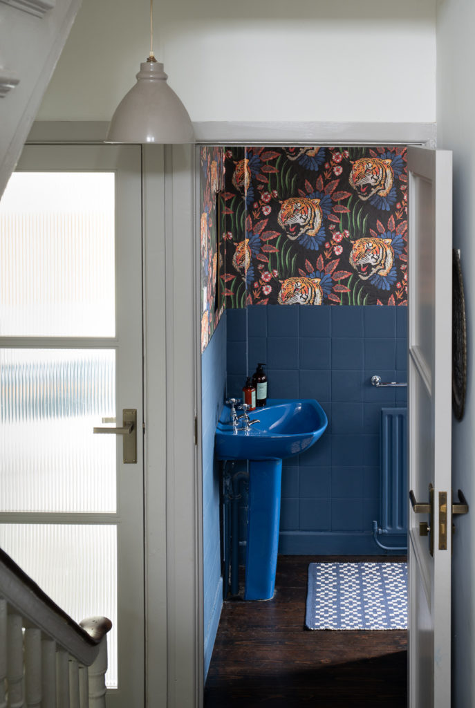
Using a neutral palette and then bringing in rich colours in smaller elements is a practical way of ensuring time is interior and one that can grow with you overtime. You can also be bolder in smaller more occasional spaces of the house. I do not think you will ever regret choosing a rich coloured or deeply patterned wallpaper in the powder room or a darker colour in a study or den room. They can add interest to the overall vibe of your home, especially if you have gone for more neutral tones in the main living areas.
When choosing paint colours, I always recommend you by sample pots and stretch your colour choices – its amazing what seeing a few large samples painted on the walls will do. I call it experimentation in a controlled way. But remember you do not need to go as far as painting a wall to bring colour in, a few new cushions, or add a large house plant can have a transformative effect.
Bibliophilia is an increasingly popular trend as we spend more time indoors and within our own four walls. It is a great way to bring colour into a space through planting and greenery, it is amazing how a dash of green can really bring a space to life.
If you are looking at selling your home getting your colours right is critical to this situation. I always say the lighter is better except a smaller spaces I can really handle a little pop to make your home and feel lighter brighter and bigger and it especially if you’re looking onto green spaces will really bring the green inside.