Interior Design Today – 2 – Space
- Interiors
- Lighting
- News
- Styling
- Textiles

Space is a luxury and understanding what you want to do with it is key when planning an interior. Home purchases have a long life cycle, buy in haste and repent at leisure, you unfortunately cannot hide an unwanted dining table in your wardrobe if it doesn’t quite fit! If possible I always recommend people should live and inhabit a space before they touch it, especially if you plan to do any major works. Where the sun hits the room – morning or evening may define where you position your breakfast table or TV. What colour you paint the walls can also be affected by orientation. We are just in the process of completing a hotel in Manchester, paint swatches we viewed in London were totally different when viewed actually painted onto the wall they were supposed to go on, the light made the colours look completely different! Which leads me to preparation…

When I start working with a new client or am working on a space for myself, the first place I start is with the brief, and by asking some key questions (in no particular order)
- What is my budget? (This is probably the most important decision you will make and will enable how far you can go. It is important from the beginning to really set this out… I would always recommend having a 10-15% contingency on all projects, money set aside to deal with unforeseens)
- What do we want the space to do?
- Who should it appeal to?
- What is my style? What look am I aiming for – layered traditional or clean cut modern? How will my taste work with the architecture of the space?
- When will it get most of its use?
- Is it a space that needs to be hard wearing such as a family living room, or is it more a special occasion type place, a dining room perhaps?
- What is the existing room use?
- What are the room dimensions?
- What are the key features of the room I want to focus the layout on?
- Is the existing structure/finish in good condition?
- Are there existing elements that can be reused/reworked? (We repainted hideous yellow 60’s tiles with a black metallic paint to completely revamp our fireplace)
- Are the electrics in the right place? Or can they be moved?
- Can I try things out- get things on loan or free samples?
- How much storage will I need?
The list goes on but answering the above and noting it down can then be a reference for the whole project. I usually do this list by room and compile room data sheets to keep track of all the ideas/information for each space in one place.
TOP TIPS: MEASURE TWICE, CUT ONCE…
When laying out a space I always use my trusty measuring tape(s) and masking tape. First off quick measure the room on paper, take the length, width and height – marking any major features, fireplace or windows for example, on the plan. Then in the room I measure out my chosen furniture marking with masking tape and adding these dimensions to my plan (if the masking tape won’t come off easily afterward– use a hairdryer 3/4” away and don’t stick it on too forcefully in the first place). By marking out furniture on the floor you very quickly get a sense of whether you should go for that 180cm instead of 160cm length sofa and if it will work with your coffee table. Laying out the space enables you to get the scale and proportion right within a room.
Once we have answered our brief we can then move to concept which is the fun part! This starts off as a mood or ideas board or collection of clippings/items that start to evoke the atmosphere you want to create in your space.
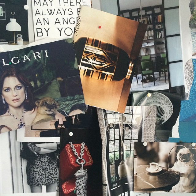
Moodboards can be as literal or as abstract as you like but are an invaluable reference point for staying on track as you put your space together.Here are some examples below, the first is a loose ideas board of clippings and ideas I liked for a moody dining room – dark greens and reds, a hint of art deco style, marble table tops, crittal screens and some leopard print!

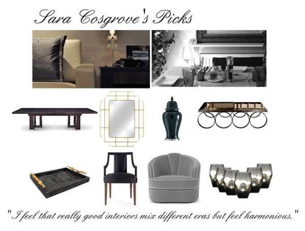
The second I did for an interior shopping site Luxdeco – it is very literal with each piece of furniture selected and a couple of concept images. This can be great if you are selecting from one company or want to see how all of your pieces will work together in a space.

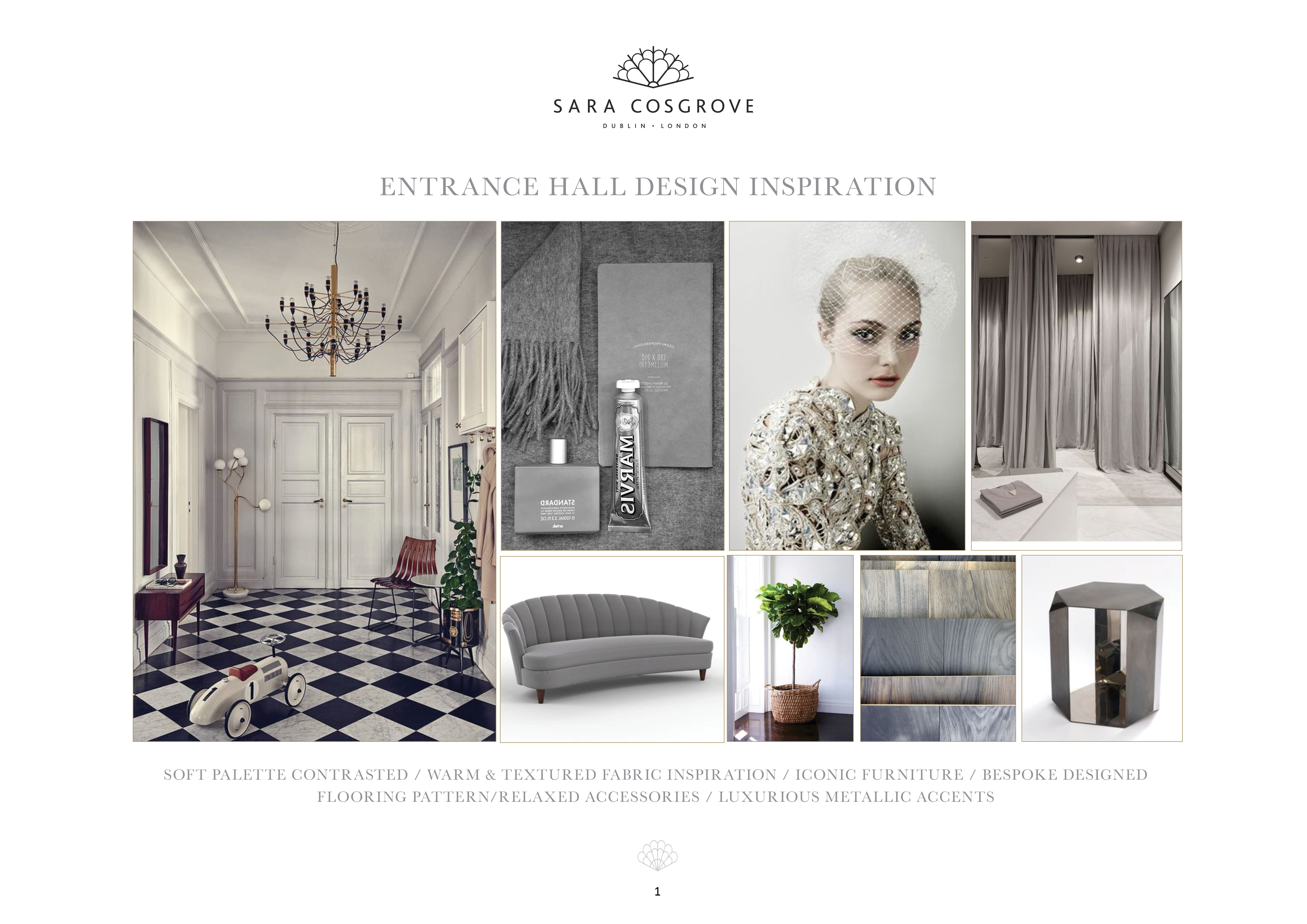
The third is for a project I recently did which is a little more textural and abstract in theme but polished in presentation… It is a combination of inspirational images, textures and key furniture items.

If you have powerpoint on your computer or even word I wold drop all my images in and print. Having my mood boards with me when I shop instore or online keeps me close to my concept and prevents me getting distracted!
TOP TIPS: SOURCING INSPIRATION…
I often use fashion magazines to source inspiration – especially if I am looking for fresh exciting colour combinations, coffee table books on iconic people and designers also give a lot of food for thought when I am coming up with ideas. Another great resource is pinterest (you can follow me by clicking the link ) you can create public or private mood boards & get lots of references if you are looking for a particular item…
Next week I am going to talk about light & how to use it to maximise your interior!
